The most variegated content on the page is easy to organize if you set up the vertical rhythm correctly. This is probably one of the most important aspects of a designer’s job that most people ignore for some reason. It’s time to set the record straight and decide once and for all who’s to blame and what we should do about it.

What is a vertical rhythm? In short, it’s a consistent, predictable arrangement of content on a page. Regarding text, it is the ratio of font size, line spacing and vertical indentation. In other words, rhythm means the arrangement of text and graphics objects in the basic grid of the site so that the elements do not go beyond its limits, being at a given distance from each other.
Why?
The task of each designer, first and foremost, to provide the user with maximum comfort of perception of content, by eliminating the visual barriers. Unfortunately, most designers practice experiments at random, which leads to rather sad consequences.
We’ve already talked to you about horizontal chaos and how to streamline it. So, vertical rhythm arranges vertical chaos.
The basic grid in Sketch 3
I haven’t opened Photoshop in a few years, so I can’t say for sure how to make a basic grid there. I would probably have to download an extraneous plugin. Sketch allows you not to get bogged down with the minutiae and build the grid thanks to the standard features of the program.
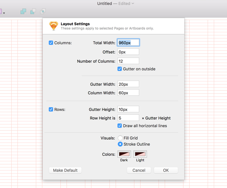
Click on the icon in the Toolbar, which is literally called “Show or hide rulers, grids and more” and go to the menu Layout Settings.

By changing the Gutter Height parameter you can achieve the desired line spacing. But how do you find the right value?

The first thing I do is to choose the right spacing for the main text.
There is an opinion that the minimum spacing is equal to the font size multiplied by 1.5. In other words, if the main font on the page is 16px, then the comfortable line spacing starts at 24 (16*1.5). More is fine, less is not desirable. The main thing is to get an even value (24, 26, 28, etc.).
Then we return to Sketch and set the Gutter Height parameter to half of the previous value, 12 (24/2).
As a result, our text fits nicely into the grid. The rest of the elements on the page should behave the same way.
In conclusion
Thanks to the vertical rhythm, you can structure the content on the page without much effort and, as a consequence, create better and more professional layouts.
